Ordinal Pattern Analysis:
A simple method for assessing simulation-observation fit
Warren Thorngate & Bruce Edmonds
http://thorngate.socialpsychology.org/
http://bruce.edmonds.name
4 March 2012
The thrill of programming a computer simulation of social behaviour can seduce its creators to believe that, if it runs, it must be true. There is something about the intense relationship between simulators and their simulations, especially their agent-based simulations, that blurs the distinction between insight and[1]. Alas, a working simulation is no guarantee of a valid one, so its creators must sooner or later address a sobering question: How well does the simulation mimic the world it was programmed to simulate? A good fit between a simulation and relevant observations may not be sufficient for asserting the simulation’s validity, but it is certainly necessary. In contrast, a bad fit is a simulation’s kiss of death – nature’s way of telling the programmer to give up or to modify the programme and try again. Between good and bad fits is a continuum of so-so, the place where most simulation-observation (S-O) fits in the social sciences are found (see any issue of the Journal of Artificial Societies and Social Simulation).
The purpose of our present effort is to outline a simple method of measuring and evaluating simulation-observation fit, and of using the resulting fitness measures to map domains of validity of competing simulations. We do so in two articles, each emphasizing often-complex simulations and incomplete observations found in the social sciences. In the present article we introduce simple goodness-of-fit indices, based on matches and mismatches of the ordinal properties of predictions and observations, that we believe have many advantages over traditional approaches to evaluating S-O fit. In the sequel we show how to use the resulting indices of S-O fit for detective work needed to explore the situations in which one simulation is more valid than another.
Statistical Signatures and Stylized
Facts
Simulations are not intended to reproduce all of the features of data that are obtained from the situation they simulate. For example, a simulation of an innovation’s adoption may be written to match the shape of an observed adoption curve, but not necessarily its exact timescale. In any validation process there is a judgment about which aspects of the results are deemed relevant and irrelevant to what is being modelled. Sometimes this distinction is explicit; more often it is derived from the simulation context.
Judgments about which aspects of the output are relevant and why are influenced by the simulator’s conception or mental model of what the simulation does and how it works. The mental model should not be confused with the actual simulation; there will inevitably be some differences between the simulation and the simulator’s ideal, and differences due to the presence of unintended simulation interactions and artefacts, which can take a great deal of effort to eliminate (Galán et al. 2009).
For this reason, some simulators use concepts such as statistical signatures and stylized facts to describe the intent of a simulation, and to suggest how it should be judged. The concepts are often employed to argue that a simulation will not reproduce exact values or levels in its outputs but rather a shape, topology, or other abstract property of the outputs.
Kaldor introduced the concept of a stylized fact in 1962 in the context of a debate about macro-modelling capital and economic growth (Kaldor 1961/1968). His purpose was to offer a way to identify and communicate key observations that demanded scientific explanation, hoping to guide the development of models rather than to validate an accomplished final model. He coined the term “stylized facts” for stable patterns that emerge from many different sources of empirical data. Kaldor argued that one can have exceptions to the stylized facts without negating the conceptual importance of these facts. Borland (1987) highlighted the argument, noting the comparative advantages of one model over the other can be clarified by examining which model best explains for the stylized facts.
Several authors have criticized the concept of stylized facts. Solow (1969), for example, said there “… is no doubt that they are stylized, though it is possible to question whether they are facts.” (page 2). Heine et al. (2005) discuss use of stylised facts for both ex ante (for guiding simulations) and ex post uses (for judging the results). They criticise the use of ad hoc, ex post stylised facts due to their weakness and possibility they can be customised to fit the simulation. Heine et al agree that stylized facts can be useful for guiding simulations but not for justifying them, and allow that a set of stylised facts could be used for comparing models against each other.
Stylised facts are widely used in social simulation and economics, particularly agent-based computational economics. For example, Cantner et al. (2001) use a “stylised fact” about a kind of distribution, and Bennett (2008) notes that, in a loose sense, “… such provocation is a common feature of insurgency.”
The concept of a statistical signature is similar to that of a stylized fact. The Oxford English Dictionary defines this use of signature as “Any typical physical or behavioural characteristic, pattern, or response by which an object, substance, etc., may be identified” (OED signature, n.). The earliest use in the recent academic literature is Gaymire and Riegler (1972) who write, “A unique statistical signature concerning the nature of the detected events is provided through the relative probability for absorption in each layer of the detector.” Here the statistical signature refers to what is significant about a pattern. The “statistical” qualifier suggests that it is a broad pattern and not the noise referenced by this term. The term statistical signature is rare in the social sciences literature; indeed its use seems limited to a few authors (for example, Moss, 2001; Edmonds & Hales, 2003).
Models in the social sciences are rarely accurate in the details of their output, but frequently capture some identifiable pattern or trend – a statistical signature of stylized fact -- corresponding to what is observed. It would thus be useful for simulators to have statistical procedures for analysing the extent to which a certain model fits a certain pattern, and for judging which of two or more simulations gives the best fit. This paper provides one set of such procedures that capture and compare the significant shapes of predictions and observations in a way that is particularly relevant to simulation models of social phenomena.
Evidential Statistics
Our ideas about useful goodness-of-fit tests bring us into the world of statistics, but not the world of statistics normally taught in social science curricula. A statistic is simply a number that represents some aspect of two or more other numbers. By tradition, a number representing an aspect of two or more measurements is called a descriptive statistic (mean, median, standard deviation, and such); a number representing some aspect of two or more descriptive statistics is called an inferential statistic (t, F, Chi Square, p-value, and the like). Most of the statistics we introduce below are neither descriptive nor inferential. They are, instead, members of a lesser known but important set of numbers called evidential statistics (see, for example, Edwards, 1972; Fisher, 1956/73; Taper & Lele, 2004) which we believe are most useful for assessing S-O fit.
As the name implies, evidential statistics are indicators of the amount or strength of evidence for or against the truth of a proposition, including a proposition that a simulation is valid. Some evidential statistics quantify the likely in likelihood, the fuzz in fuzzy sets and the degree of belief derived from Bayes’ Theorem. They are well suited to guide us in pursuing scientific detective work and to reach conclusions rather than decisions about S-O fit (Turkey, 1960, 1969).
It is important to understand that the evidential statistics we develop below are not inferential statistics; those seeking another way to uncover statistically significant differences will find none here. We are not interested in the inferential challenge of generalizing from samples to populations. Instead, we are interested in the evidential challenge of generalizing from predictions to observations. The evidential statistics presented below indicate how close and how often predictions match observations, and how we should adjust our degree of belief in a simulation generating the predictions after calculating S-O fit. The evidential statistics presented in our second article indicate the conditions under which predictions match or mismatch observations, and how we can use knowledge of the conditions to compare, contrast, and perhaps integrate alternative simulations.
Measuring Goodness of
Simulation-Observation Fit
Suggestions for measuring simulation-observation fit have existed at least since astronomers began comparing the predictions of celestial theories to observations of planets, moons and stars. Almost all the suggestions are derived from the assumption that S-O fit can be expressed as a distance between what a simulation predicts and what is observed. The smaller this distance, the better the fit. Thus, if Simulation A predicted a person’s income would be $4,000, $5,000 and $3,000 over three consecutive months, and if we observe the income to be $3,998, $5,004, and $2,978 in these months, we might note the small distances between the three predictions and the three observations, and declare that Simulation A gave an excellent S-O fit. In contrast, if Simulation B predicted income to be $17,450, $45, and $8,132 during the same three months, then we might note large distances between predictions and observation and likely conclude that Simulation B gave a relatively bad S-O fit.
Occasionally, predictions are as good as those of Simulation A or as bad as those of B. At these extremes, it easy to judge the fits with a classic Inter-ocular Trauma Test – observing S-O differences so small or large they hit us between the eyes. More often, however, S-O differences, especially those in social sciences, lie somewhere between the extremes, prompting a more objective and nuanced approach to assessing simulation-observation discrepancies. In these cases it seems appropriate to employ numbers invented to measure S-O fit.
What is a good measure of S-O fit? Most extant measures, such as root-mean-square, chi-square and regression coefficients, were invented for the natural and biological sciences. Although they can often be invoked to assess S-O fit in the social sciences, their invocation often suffers at least two drawbacks. First, most of the measures require predictions be made, and observations be measured, as points on a real-number (ratio) scale, yet most social science simulations and measures generate no more than an ordinal or an ordered metric scale. Second, traditional uses of the measures require data to be aggregated before analysed, even though a considerable proportion of social science data reveal their secrets only when analysed first, then aggregated. Both of these drawbacks deserve further consideration.
Levels of Measurement
As noted above, most
traditional measures of fit require that the predictions of a simulation and
the observations employed to test the predictions be made on a ratio scale
– a scale on which quantities predicted and observed conform to the
measurement requirements of addition, subtraction, multiplication and division.
As a result, the fitness measures are not useful for a simulation predicting,
for example, “a big shift in attitudes soon after a scandal” or ”a gradual
increase in stress” because we cannot multiply “big” by “soon” or divide stress
by “gradual.” These terms must first be quantified because traditional measures
of fit require predictions such as “3.24 hours after the scandal, attitudes
will change from 4.91 to 6.37” or “blood pressure indicants of stress will
increase by 1.9 units per hour.” Without such quantification, traditional
measures of fit cannot validly be calculated and traditional, high-status,
inferential statistical tests cannot be validly employed.
What to do? Social scientists are divided. Some of them, including most economists and behavioural scientists, limit their research to variables such as time, money or body counts that do meet the measurement requirements of traditional goodness-of-fit tests and their associated inferential statistics. Other social scientists assume their measures of observations approximate traditional scale requirements, then march on with traditional goodness-of-fit and inferential statistical tests. These are the social scientists who, for example, calculate average rating scale responses within and across research participants knowing that the psychological distances in the midpoint of the scale are smaller than at the scale extremes, and that different participants interpret the scale differently, but assume that everything will “average out.” Still other social scientists, qualitative researchers, eschew the use of any numbers that limit their topics of research, preferring to record and summarize their observations in words or images.
We propose an ordinal alternative. Almost all theories in the social sciences, including those on which simulations are constructed, make “greater than, less than” predictions. Examples include theories that predict prices will rise over time (translation: prices this year will be greater than prices last year but less than prices next year) and simulations suggesting that attitude change will be more positive following face-to-face communication than following written communication. In addition, almost all measurements of social science observations have at least ordinal properties. Examples include measures of prices ($100 is usually of greater value than $1) and attitude change (+3 on a 7-point scale of liking-disliking is more positive than +1 or -2). So it seems sensible to construct a measure of S-O fit based on the similarities and differences between the ordinal properties of predictions and the ordinal properties of observations. This is what we do.
Aggregation and analysis
The preponderance of ordinal predictions and observations is not the only distinguishing characteristic of social science research. Another is the preponderance of data collected from people with a wide variety of dispositions who can and do learn a wide variety of different strategies for adapting to a wide variety physical and social circumstances, all of which are likely to change over time. A century of social science research confirms what has been suspected for millennia: social phenomena are every bit as rich, complex and intertwined as their biological cousins. Their richness is most often revealed over time in longitudinal studies of individuals or groups (London & Thorngate, 1981).
Alas, the proportion of longitudinal studies in the social sciences is shockingly small, for at least two reasons. First, such studies are difficult and risky. Longitudinal studies, by definition, take time; many of the best ones would, if undertaken, take decades. Current academic norms of productivity (expected publication rates, research grant renewal criteria, etc.), logistic challenges, and the uncertainties of collecting data over time conspire to mitigate against researchers venturing beyond far easier, cross-sectional, “snapshot” research methods. Most researchers who do pursue longitudinal social science research must make do with extant archival data – stock market averages, crime rates, traffic volumes, and the like – collected for other purposes and often missing potentially useful information.
Another reason for a dearth of longitudinal studies is statistical. The models favoured in traditional statistical practice – those genuflecting to Ptolemy by partitioning variance into cycles (main effects) and epicycles (interaction effects) – assume that observations are independent and thus can be validly aggregated, usually by averaging, to filter in signals and filter out sampling error or noise. Analyses of the aggregations are then conducted in hopes of revealing “significant differences” which become the stuff used to test the predictions of theories.
Unfortunately, when studying people or groups over time, the assumption of independent observations is almost always wrong, sometimes a little bit wrong, sometimes a lot. A century of social science research clearly demonstrates that people’s actions and interactions are the result of a network of thousands of influences which reveal their effects over time. These are effects which cannot be meaningfully sliced into independent components nor easily separated from sampling error by averaging across observations. This confronts researchers with three choices: (A) change statistical practice; (B) pretend that observations are no more than a little bit dependent; (C) avoid longitudinal studies. Sadly, alternatives B and C seem to be preferred.
Because we believe it is better to adapt statistical practices to the nature of social science phenomena rather than to select social science phenomena to suit the nature of statistical practices, it is our challenge to invent the practices desired. The ones we propose here try to avoid the limits of tradition by changing the nature of aggregation and reversing the order of analytical practice. We assume that, in the social sciences, it is more often useful to analyse individual cases first, then aggregate over these analyses, than to aggregate first, then analyse the aggregations. We also assume it is more meaningful in the social sciences to examine what happens in general than what happens on average.
The conclusions of aggregate-then-analyse versus analyse-then-aggregate procedures are not always the same. Suppose, for example, that six people were asked for their attitude toward Québec separation from Canada, before and after reading an editorial about it. Suppose as well that each person was asked to indicate her/his attitude on a traditional -3 (very negative) to +3 (very positive) rating scale, and that all six people gave a neutral (0) pretest rating. Finally, suppose that, after reading the editorial, the six people gave the following posttest ratings: +3, -2, -1, +2, -3, +1.
Did the editorial have any effect on attitudes? Let us first aggregate, then analyse in a traditional way. Traditional practice nudges us to look for a difference in one kind of aggregate: pretest and posttest averages. The pretest average is (0+0+0+0+0+0)/6 = 0.0. The posttest average is (+3-2-1+2-3+1)/6 =0.0. Now let us analyse these two aggregates: On average, the editorial had no effect. There is, of course, a large difference in the variances of the pretest and posttest ratings. But traditional statistical analyses in the social sciences rarely focus on variance differences; unlike their colleagues in ecology and evolutionary biology, social science researchers have been taught to fixate on differences in central tendency, and to be mildly annoyed by differences in other features of their data.
Now let us first analyse, then aggregate. The first person changed her/his attitude from 0 to +3. The second person changed from 0 to -2. The remainder changed from 0 to -1, +2, -3 and +1. Now we aggregate these analyses by counting heads: Six out of the six people changed their attitude after reading the editorial; so, In general, the editorial had an effect on people’s attitudes towards Québec separation. What occurs in general does not always occur on average. By ignoring differences that do not express themselves in averages, we stand a good chance of overlooking patterns that would increase our understanding of interesting and important social science phenomena.
What now?
In summary, we believe new indicants of simulation-observation fit should be adapted to the realities of social science simulations and observations. The new indicants should generate evidential statistics, rather than inferential statistics, that are easy to interpret and useful for scientific detective work. They should allow researchers to analyse the fit of ordinal predictions to the ordinal properties of observations. And they should allow researchers to analyse data from individual cases when available before aggregating across the analyses, in addition to the more traditional practice of aggregating the data before analysing them.
What follows is an introduction to indicants we invented to meet all of the above requirements, indicants distilled from what we call Ordinal Pattern Analysis (OPA) for reasons that we hope will emerge below. The development of OPA began in 1975 after one of us (WT) listened to a Canadian Broadcasting Corporation radio programme called As It Happens that conducted an interview with Denys Parsons, a British writer and occasional BBC persona, who published that year a Directory of Musical Tunes and Themes. Parsons was afflicted with the delightful habit of humming tunes, the names of which he frequently did not remember. So he developed a method of encoding tunes, then wrote down the code, name and composer of each tune on an index card. Over the years he collected over 14,000 cards for as many tunes. To his surprise, each code was unique; no two tunes had exactly the same code. He alphabetized the codes, dictionary style, and published his directory.
Parson’s genius was in developing the code. By trial and error, Parsons discovered that a tune could be encoded by the ordinal pattern of its first 16 notes. Sing, hum, or whistle the first note, then the second. if the second goes up from the first, write down a “u.” If the second note goes down from the first, write down a “d” and if the second repeats, write “r.” Now think of the third note of the tune, compare it to the second note and write down “u, “d,” or “r.” Next, compare the third versus fourth note in the same manner, the fourth versus fifth, etc. until the 16th note. The result will be a string that looks something like this: “urduuuuuduuruuu” – a string generated by a famous Canadian song. What is it? Buy Parson’s directory. Skip past its “d” section and its “r” section and look up the string in the “u” section. It should give you the tune’s name: O Canada (the national anthem) by Calixa Lavallée. By contrast, the string “ruduuuruddduddu” encodes God Save the Queen.
Think of Parson’s directory as a list of the ordinal predictions of 14,000 simulations. Think of the code of your humming as a set of ordinal properties of 16 observations. Think of finding the best match of your observations to the the 14,000 simulations as one example of Ordinal Pattern Analysis. Parson’s scheme considers only adjacent notes; we can also consider the ordinal pattern of non adjacent notes. His scheme also looks for perfect directory-tune matches; we can also consider imperfect matches, providing indices of closeness to perfection useful for deciding which simulations provide the best S-O fit. What follows is little more than a generalization of Parson’s scheme, variants of a procedure adapted to different research designs and circumstances. One of us has previously published articles on Ordinal Pattern Analysis and its use in analysing single-subject, longitudinal designs in psychology (Thorngate, 1986a, 1986b, 1992; Thorngate & Carroll, 1982). Here we adapt and extend the technique to assist in evaluating the fit between simulations and observations.
Introducing Ordinal Pattern Analysis
In 1969, economist Thomas Schelling published the first version of what has become a classic social simulation, one that now appears in almost all social simulation textbooks and programme demonstrations for languages such as NetLogo. The simulation demonstrates the link between prejudice (a cognition) and discrimination (a behaviour), in particular how small personal preferences hypothetical home owners have for neighbours “of their own kind” can quickly segregate neighbourhoods. Most versions of the simulation begin by placing varying numbers of home-owing agents at random on a chessboard-style grid, each square on the grid representing a home (occupied or vacant). Some of the agents are red, some are green, and all prefer having same-colour agents as neighbours. Over hundreds of iterations, each agent counts the number of same-colour and different-colour agents in adjacent homes (the eight squares surrounding the agent’s home). Then the agent applies a decision rule supplied by the programmer. One such rule might be, “If fewer than five of the eight homes around me house other agents of my colour, then look for another home that has five or more surrounding homes housing agent of my colour. If such a home is found, move.” Another such rule might be, “Look for another home with more agents of my own colour with probability p calculated as the ratio of other-coloured agents to agents adjacent to me.” The simulator can also vary the number of red agents and green agents.
When the grid of the simulation is animated on a computer screen, a drama unfolds: the original random mix of red and green agents rearrange themselves into clusters of red agents and clusters of green agents separated by pathways of unoccupied homes. Varying the populations of agents and their degree of preference do influence the rate at which movement occurs, but do not much affect end of its trajectory: Steady-state segregation. It takes no more than a dash of imagination to believe this is how segregation happens, even to speculate that, if even the smallest degree of prejudicial preference exists, segregation is inevitable.
But is it inevitable? While most of us can recall visiting, even living in, segregated neighbourhoods, most of us are also likely to recall integrated neighbourhoods or neighbourhoods undergoing integration. Is memory deceiving us? Are integrated neighbourhoods so rare that we need not doubt the depressing trajectory of Schelling’s demonstration?
A reality check seems in order, one that tries to match the outputs of Schelling’s simulation with observations of real neighbourhoods. It would do no good to examine several neighbourhoods at only one point in time because we would still not know whether they were headed toward segregation or integration. So we would likely want archival data of the owners of homes in a several different neighbourhoods, data that would reveal attributes of each owner (age, education, socio-economic status, skin colour, etc.) over a period of, say, 100 years. If such archival data could be found, we could then examine each home, each year, calculate the proportion of neighbours with similar attributes, and observe how closely this proportion followed the trajectory of the Schelling simulation.
Sadly, such archival data is likely difficult to find. Happily, it doesn’t matter. Schelling’s segregation simulation is traditionally discussed in the context of housing, but there is nothing in the simulation’s assumptions to suggest it is limited to housing. Schelling never declares that his ideas are only valid in suburbia. Without such a scope condition, we are free to observe other kinds of neighbourhoods to assess S-O fit.
A classroom provides another kind of neighbourhood that seems far easier to observe than a housing tracts. Each week of an academic term (semester) offers an opportunity for students to walk into class, look around, and freely choose where to sit. Observations about who sits with whom can be gathered over a term of 12 to 16 weeks with relative ease. In addition, the costs of moving from seat to seat in a classroom are far lower than the costs of moving from house to house, thus removing one constraint and possible confound relocation decisions.
Schelling’s simulation is also traditionally discussed in the context of skin colour preference, but these is nothing in the simulation programme to suggest this must be the only basis on which preferences for neighbours are established or expressed. Dozens of other features for comparison might exist, including sex, age, family membership, friendship, first language, religion, and similarity of interests. It would no doubt be useful to measure in some way as many features as possible, and to measure as well the strengths of students’ preferences for gathering with other students who share or do not share these features. The measurement task, however, is likely to be daunting. So it is probably more prudent to assess the S-O fits of simulation predictions that do not require such measurements. We need only observe who sits next to whom over the course of the academic term then invent a statistic or two that indicates the extent to which the same people are clustering from one week to the next. If the simulation’s predictions related to these clusters produce a good S-O fit, then we can devise a follow-up study to address some of the simulation’s other predictions. If, however, the S-O fit stinks, then we need not bother with a follow-up until we rethink the simulation’s assumptions.
Among the predictions derived from Schelling’s segregation simulation, at least two can be tested simply by noting who is sitting in each seat, each week.
· Hypothesis A: As the term progresses, an
increasing proportion of students will sit where they sat the previous week;
· Hypothesis B: The rate of increase in this
proportion will decline as the weeks of the term go by.
These hypotheses can be plotted as a family of curves having a common shape, prosaically described as (A) monotone increasing and (B) negatively accelerated. Figure 1 illustrates four such curves in the family. Notice that all increase over time, never dipping below horizontal (monotone increasing), and that they go up faster earlier in the term than they do later in the term (negatively accelerated).
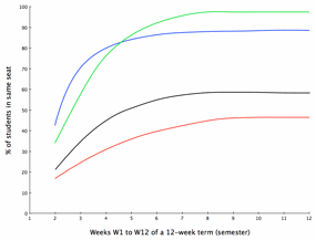
Figure 1. A family of curves generated by the segregation simulation.
The monotone increasing prediction of Hypothesis A generates a large set of predicted ordered pairs or POP Set. For example, Hypothesis A predicts that the percentage of students occupying the same seat in week W2 will be no greater than the percentage of students occupying the same seat in week W3 and in W4, W5, …., W12. Similarly, Hypothesis A predicts that W3 will be no greater than W4, W5, …, W12. See the pattern? Hypothesis A, though succinct, makes a prediction about the order observations for all 11*10/2 = 55 pairs of weeks. Not too different from Parsons’ 14,000+ tunes generating predictions about adjacent notes.
The negatively accelerated prediction of Hypothesis B also generates a large POP Set. For example, Hypothesis B predicts that the difference in percentages between weeks W2 and W3 (= W3-W2) will be no less than the difference in percentages between weeks W3 and W4 (= W4-W3), W5-W4, …, and W12-W11. Repeating the pattern, Hypothesis B also predicts that W4-W3 will be no less than W5-W4, W6-W5, …, and W12-W11. In all, 9*8/2 = 36 such pairs of ordinal predictions of differences can be made.
Because Hypotheses A and B include the possibility that two percentages can be equal, each makes weak, “greater-than-or-equal-to,” rather than stronger “greater-than,” ordinal predictions. Hypothesis A predicts that for all each i,j pair (i = 2 to 11, j=i+1 to 12),
Wj >= Wi.
Hypothesis
B predicts that for each i,j pair (I = 2 to 10, j = i+1 to 11,
[W(i+1) – W(i)] >= [W(i+j+1) –
W(i+j)].
Measuring ordinal goodness of fit
Now suppose we observed six classes each week over the course of a 12-week term, gathering data on seating patterns by passing an attendance sheet showing seat numbers and blanks for names down the rows of each class each week, allowing us to reproduce the weekly seating pattern, including empty seats. From these records we calculate the percentage of students in weeks 2-12 who sat in the same seat they did in the previous week. Some hypothetical results for five classes are shown in Table 1.
Table
1. Percentage of students sitting in previous week’s seat.
|
|
Week |
|||||||||||
|
class |
W1 |
W2 |
W3 |
W4 |
W5 |
W6 |
W7 |
W8 |
W9 |
W10 |
W11 |
W12 |
|
C1 |
-- |
53 |
81 |
78 |
83 |
88 |
95 |
92 |
NA |
97 |
100 |
100 |
|
C2 |
-- |
79 |
89 |
92 |
60 |
88 |
95 |
NA |
100 |
94 |
NA |
100 |
|
C3 |
-- |
24 |
56 |
40 |
68 |
51 |
75 |
72 |
62 |
80 |
53 |
71 |
|
C4 |
-- |
77 |
70 |
82 |
96 |
94 |
12 |
78 |
72 |
89 |
91 |
88 |
|
C5 |
-- |
90 |
84 |
93 |
88 |
88 |
95 |
93 |
98 |
100 |
100 |
94 |
|
average |
|
|
|
|
|
|
|
|
|
|
|
|
Because Hypothesis A predicts that the percentage of students sitting in the same seat will not decrease over time, we can now check each of the five classes to see how many of the 55 pairs of weeks show Wj >= Wi for all i = 2 to 11 and all j>i+1 to 12. Each time the observed ordinal relation matches the “>” prediction, we tally one hit. Each time the observed ordinal relation is the reverse of the prediction (meaning “<”), we tally one miss. And each time two observations are equal, we tally one tie. If we have a missing observation we tally an NA.
Here
is an example of a tally from class C1.
Test
1: Is
W3(=81) >= W2(=53)? Hit!
Test
2: Is
W4(=78) >= W2(=53)? Hit!
…
Test
7: Is
W9(=NA) >= W2(=53)? NA!
…
Test
11: Is
W4(=78) >= W3(=81)? Miss!
Test
12: Is
W5(=83) >= W3(=81)? Hit!
…
Test
55: Is
W12(=100) >= W11(=100)? Hit!
Now
let us summarize :
·
Number of Hits for class C1 = 42;
·
Number of Misses for class C1 = 2;
·
Number of Ties for class C1 = 1;
·
Number of “NAs” for class C1= 10.
Of the 55 pairs, we are able test the ordinal prediction 55-10 = 45 times. And of these 45 tests, 42 are hits, two are misses, and one was a tie.
What to do with ties? There are at least three possible answers. First, we can count ties as hits when we are predicting a weak (>=) order and count them as misses when we are predicting a strong (>) order. This preserves the logical integrity of the predictions, but can lead to ambiguous evidence when observations are many and their scale of measurement is crude. Consider, for example, testing a prediction that posttest attitudes of 1,000 participants will be more favorable than pretest attitudes as measured on a 3-point scale of negative = -1 neutral = 0, positive = 1. There would likely be many ties; hundreds of people might not to change their attitudes enough to push them from one scale value to another. So it is possible that the results would show, say, 800 people not changing their attitude rating from pre- to posttest, and the remaining 200 changing their attitude from -1 to 0, from -1 to +1, or from 0 to +1. By counting ties as misses, 80% of the participants would show evidence against the prediction, even though 100% of the 200 people who did change their attitude changed in the predicted direction.
A second way to handle ties is to allocate them proportionally across the hits and misses. Thus, for example, if 700 of the 1,000 people in the previous example changed their attitudes in the predicted direction (hits), 200 changed opposite to the predicted direction (misses), and 100 were tied, then 700/900 * 100 or about 77 of these ties would be called hits, and 200/900 *100 = about 23 of them would be called misses. This would be a reasonable compromise if ties were few and if there were reasons to believe that a refined version of the measurement scale would resolve most ties. Some texts of classic, ordinal, nonparametric tests (see, for example, Siegel & Castellan, 1988) recommend this strategy, largely to reduce the biases of theoretically- derived sampling distribution estimates caused by ties.
A third way to handle ties is to ignore them, counting them as neither hits nor misses. The net effect would be to treat ties as measurements not available (NA) for tests of a simulation’s ordinal predictions. As the number of ties increased, this strategy would give an increasingly biased estimate of theoretically-derived sampling distributions, but not of empirically-derived ones. Thanks to the invention of resampling statistical methods (see, for example, Diaconis & Ephron, 1983), we can rely on empirical distributions to give good estimates of the evidence available.
Our ecumenical instincts lead us to assert that the above three strategies for handling ties all have their merits and each should be used according its relevance to the simulation and observations at hand. Our biases lead us to recommend that alternative three, ignoring ties, should be the preferred, default option.
Useful indices of fit. Let us now define three indices that seem useful in communicating the results of our S-O counts.
Scope = #observation
pairs addressed by simulation / #observation pairs
PH: Proportion of Hits = (#hits) / (#hits + #misses)
IOF: Index of Observed Fit = [#hits - #misses] / [#hits + #misses]
The first is the scope of the predictions of a simulation, defined as the proportion of observation pairs that are addressed by the simulation. In the example above, the simulation addresses all 55 possible pairs (100%) of observations, so the scope of the simulation is 1.00. As we will show below, it is quite possible that a simulation would not address all possible observation pairs; this will be important when comparing the fits of two or more simulations.
PH is simply the proportion of hits in our tests. If our observations were random, we would expect PH to equal 0.50. A perfect fit would generate PH = 1.00. In the example above with 42 hits, two misses and one tie, PH = (42)/(42+2) = 0.95; 95% of the untied tests were hits.
IOF, ranging from -1.00 to +1.00, provides a related index for those who prefer one that looks like a correlation coefficient. Indeed, when a hypothesis makes predictions for all possible pairs of observations (Scope = 1.00) and when there are no missing observations, IOF is mathematically equivalent to Kendall’s Tau. Like Tau, an IOF of 0.00 indicates no relation between predictions and observations; +1.00 indicated a perfect association, and -1.00 indicates a perfect negative association. In the example above, IOF = (42-2) / (42+2) = +0.91.
Does a PH value of +0.95 or an IOF value of +0.91indicate a good fit? It seems pretty close to perfect, so it is difficult to ignore. It is surely better than a PH value below 0.50 and a negative IOF. The question, however, leads us to the convoluted and emotional topic of statistical significance. So a brief diversion seems appropriate.
Statistical significance. Those of us socialized to embrace the traditional concept of statistical inference tend to become obsessive about it. No analysis seems complete without a test of statistical significance; no finding seems important without asterisks attached. Though attempts are occasionally made to lower the scientific importance of significance tests to the level they deserve, they remain as common as “God bless you!” after a sneeze.
As noted above, inferential tests of significance serve little purpose when assessing matches between simulations and observations because there is no such thing as a “significantly good fit.” Evidential statistics are not inferential statistics and should not be conceived or used in the same way. Still, evidential statistics do claim to help us assess evidence, especially the extent to which observations give evidence for or against a prediction. As a result, it seems reasonable to assemble a test that makes us adjust our belief in the hypothesis or simulation generating the prediction in light of the evidence. One such test combines Fisher’s (1937) method of randomization with Edwards’ (1972) concept of likelihood in addressing the following question: How likely is it that a random permutation of the observations would produce a PH (or IOF) at least as great as the permutation actually observed?
Consider again, for example, the 10 observations and one “NA” collected for class C1 in Table 1. If the order of these observations were generated by a random process, then each of the 10 observations and one NA would have an equal likelihood of occurring in week W2, in week W3, etc. There are 11! = 39,916,800 permutations of these 10+1 observations. What proportion of these permutations would generate a PH or IOF at least as large as the ones we obtained? If the proportion were relatively small, say less than 1/20, we would likely increase our belief in the validity of our simulation for class C1. If the proportion were relatively large, say 17/20, we would likely decrease our belief in the validity of the simulation for class C1.
Our task now is to count the number of 11! permutations of our observations that would produce a PH >= 0.96 or an IOF >= 0.91. But life is short and counting to 40 million is boring, so to save both we should write a computer programme that will do the counting for us. But even modern computers won’t run almost 40 million iterations in the blink of an eye. Thankfully they don’t need to. A healthy sample of these 40 million iterations is all we need to get a fairly accurate assessment of the proportion that exceeds the values obtained by our simulation; we believe 1,000 iterations is a healthy sample.
Appendix A lists a simple computer programme, written in the language “R”, that does the calculations. R is available for free download at http://www.r-project.org/ in versions compatible with almost all desktop and laptop computers. Appendix A also lists the steps needed to enter data and run the programme. Using the programme in Appendix A, we can estimate the probability of a random permutation of the 10 + NA = 11 values in class C1 exceeding the obtained PH value of 0.96 (IOF = 0.91) is less than 0.001.
Using the same programme we can continue to calculate the number of hits, misses, ties, NA, PH, IOF and probability of hits or greater for classes C2, C3, C4, and C5. Table 2 presents them all.
The table
shows that classes C1, C4, and C5 fit the predictions of the simulation rather
well. In contrast, classes C3 and C4 did not fit the predictions well at all.
The contrast should lead a curious researcher to wonder what, if anything,
might distinguish the C1, C4, and C5 classes from the C2 and C3 classes. It
could be, for example, that the former three classes were delivered in standard
lecture format, but C2 and C3 were classes that encouraged students to form
teams, and allowed students to shift from team to team depending on the week’s
in-class assignment. A bit of detective work, including a chat with class
teachers, might reveal such distinguishing features and this, in turn, might
lead to some thoughts about the domain of validity of the simulation, the
situations in which the simulation is good versus bad in making accurate
predictions. The detective work might begin by seeking an explanation for
anomalous findings – the outliers. A chat with the professor teaching C4
on week 7, for example, might reveal that a fire alarm was triggered as soon as
the class began, that most students did not return to class, and that the
professor told those remaining to move up closer to the front of the lecture
hall. In such cases, it might be worthwhile to change outliers to “NAs” to see
how the change influences the analysis results.
Table 2.
Summary of prediction-observation fits for five university classes
|
Class |
Hits |
Misses |
Ties |
NA |
PH |
IOF |
p-value |
|
C1 |
42 |
2 |
1 |
10 |
0.96 |
0.91 |
0.001 |
|
C2 |
28 |
7 |
1 |
19 |
0.81 |
0.61 |
0.016 |
|
C3 |
26 |
28 |
1 |
0 |
0.47 |
-0.04 |
0.563 |
|
C4 |
32 |
23 |
0 |
0 |
0.58 |
0.16 |
0.260 |
|
C5 |
42 |
10 |
3 |
0 |
0.82 |
0.64 |
0.005 |
|
average |
34.0 |
14.0 |
1.20 |
5.80 |
0.73 |
0.46 |
-- |
The
analysis above examines the S-O fit of each class over 11 weeks of a school
term. It is also possible to examine the S-O fit of each week over the five
classes. Consider again the data in Table 1. Three of the five classes (namely
C1, C2, and C3) fit the prediction that W3 >= W2; all five of the classes fit
the prediction that W4 >= W2. It is possible to calculate PH, IOF and
p-values for all 55 of these pairwise comparisons, then look for patterns in
their values. Schelling is unclear about the analogous amount of time between
his simulation’s iterations – should we assume each “tick” of the
simulation is equivalent to a second, minute, day, week, month, or year? If it
were slower than once per week, we might expect a steady rise in PH and IOF
values as we shift from adjacent predictions (Wi+1 >= Wi) to mist distant
predictions (for example, Wi+5 >= Wi).
Analysing differences
in differences.
Recall that we derived two hypotheses from Schelling’s simulation. Hypothesis
A, analysed above, predicted a steady rise in the proportion of students who
sat in last week’s seat as the weeks of the term dragged on. Hypothesis B
predicted the rate of increase in this proportion would decline as the weeks of
the term went by. Traditional statistical analysts see Hypothesis B as a
quadratic trend, testable by separating linear from quadratic trends, then
testing the latter for statistical significance. We take a simpler approach.
Because our
observations are proportions, they satisfy all the requirements of a ratio
scale, we can add, subtract, multiply and divide them with a clear conscience.
Hypothesis B predicts differences in differences, leading us to subtraction.
How many of these differences can be compared? Lots. The calculation is a bit
complex, so brace yourself for an explanation.
The
adjacent difference, W3-W2, can be compared to all remaining adjacent
differences: W4-W3, W5-W4,… W12-W11; there are nine of these. Similarly, the
adjacent difference W4-W3, can be compared to all subsequent differences:
W5-W4, W6-W5,…, W12-W11; there are eight of these. The progression continues
until the last comparison: W10-W11 versus W12-W11. In sum, 9+8+…+1 = 45
comparisons of adjacent differences can be made
The
“two-steps-away” differences can also be compared. According to Hypothesis B,
W4-W2 (two steps away) should be greater than the following adjacent
differences: W5-W4, W6-W5, W7-W6, W8-W7, W9-W8, W10-W9, W11-W10, and W12-W11;
there are eight of these. In addition, the W4-W2 difference should be greater
than all remaining two-steps-away differences: W5-W3, W6-W4, W7-W5 W8-W6, W9-W7,
W10-W8, W11-W9, and W12-W10; there are eight of these. In sum, there are 8 + 8
= 16 comparisons that can be made to the W4-W2 difference.
Extending
this progression to the next pair of two-steps-away differences, W5-W3 should
be greater than the adjacent pairs W6-W5, W7-W6, W8-W7, W9-W8, W10-W9, W11-W10,
W12-W11, and the following two-steps-away differences: W6-W4, W7-W5, W8-W6,
W9-W7, W10-W8, W11-W9, W12-W10; the total number of comparisons with W5-W3 is
thus 7 + 7 = 14. And so the progression continues until W11-W9, which is
predicted to be greater than the adjacent pair W12-W11 and the two-steps-away
pair, W12-W10. In sum, we can make 16 + 14 + 12 + 10 + 8 + 6 + 4 + 2 = 72
two-steps-away predictions.
In a
similar fashion, we can generate a set of predictions for three steps away,
four steps away, etc. The number of such predictions rises rapidly with the
number of data points to be compared. So too does the tedium and confusion of
enumerating them, defeating one intention of Ordinal Pattern Analysis: to make
such analyses simple and understandable. What to do? We offer a pragmatic
suggestion: If you want to test a straightforward difference-of-differences
prediction such as the one in Hypothesis B, then start by calculating the set
of adjacent-difference predictions (see above) to see if the results show clear
or cloudy support for the prediction. Continue to two-steps-away and upper
level comparisons only if you wish to delve into the subtleties of your data.
How well do
the predictions of Hypothesis B fit the observations? It is probably worthwhile
to calculate the relevant PHs and IOFs by hand, at least until you get a feel
for what is going on. After that, or if you are momentarily impatient, you can
use the function “gt(predicted,observed)” to do the same thing in the blink of
an eye.
We begin by
calculating the differences in same-seat proportions shown in Table 1. The
results are shown in Table 3, below.
Table 3.
Differences in same-seat proportions across adjacent weeks
|
|
Adjacent
weeks |
|||||||||
|
Comparison |
1 |
2 |
3 |
4 |
5 |
6 |
7 |
8 |
9 |
10 |
|
class |
W3-W2 |
W4-W3 |
W5-W4 |
W6-W5 |
W7-W6 |
W8-W7 |
W9-W8 |
W10-W9 |
W11-W10 |
W12-W11 |
|
C1 |
28 |
-3 |
5 |
5 |
7 |
-3 |
NA |
NA |
3 |
0 |
|
C2 |
10 |
3 |
-32 |
28 |
7 |
NA |
NA |
-6 |
NA |
NA |
|
C3 |
32 |
-16 |
28 |
-17 |
24 |
-3 |
-40 |
8 |
13 |
-32 |
|
C4 |
-7 |
12 |
14 |
-2 |
-82 |
66 |
-6 |
17 |
2 |
-3 |
|
C5 |
-6 |
9 |
-5 |
0 |
7 |
-2 |
5 |
2 |
0 |
-6 |
|
average |
11.4 |
1.0 |
2.0 |
2.8 |
-7.4 |
14.5 |
-13.7 |
5.2 |
4.5 |
-10.2 |
Using the
comparison numbers in Table 3, top row as a shorthand for the differences, and
following the guidelines in Appendix A for entering them into the R programme,
we enter the following 45 predictions (1 >= 2, 1 >= 3,…, 9 >= 10)
about the adjacent differences into a vector of all pairs as follows:
- predicted =
c(1,2,1,3,1,4,1,5,1,6,1,7,1,8,1,9,1,10,2,3,2,4,2,5,2,6,2,7,2,8,2,9,2,10,
3,4,3,5,3,6,3,7,3,8,3,9,3,10,4,5,4,6,4,7,4,8,4,9,4,10,5,6,5,7,5,8,5,9,5,10,6,7,6,8,
6,9,6,10,7,8,7,9,7,10,8,9,8,10,9,10) - observed
Class1 =
c(28,-3,5,5,7,-3,NA,NA,3,0)
Class2 =
c(10,3,-32,28,7,NA,NA,-6,NA,NA)
Class3 =
c(32,-16,28,-17,24,-3,-40,8,13,-32)
Class4 =
c(-7,12,14,-2,-82,66,-6,17,2,-3)
Class5 =
c(-6,9,-5,0,7,-2,5,2,0,-6)
The results
of using the “gt(predicted,observed)” function from Appendix 1 are shown in
Table 4.
Table 4.
Summary of prediction-observation fits for adjacent distances.
|
Class |
Hits |
Misses |
Ties |
NA |
PH |
IOF |
p-value |
|
C1 |
17 |
9 |
2 |
17 |
0.61 |
0.29 |
0.226 |
|
C2 |
9 |
6 |
0 |
30 |
0.60 |
0.20 |
0.356 |
|
C3 |
30 |
15 |
0 |
0 |
0.67 |
0.33 |
0.096 |
|
C4 |
21 |
24 |
0 |
0 |
0.47 |
-0.07 |
0.639 |
|
C5 |
23 |
20 |
2 |
0 |
0.51 |
0.07 |
0.409 |
|
average |
20.0 |
14.8 |
0.8 |
9.4 |
0.57 |
0.16 |
-- |
The results
in Table 4 offer little support for Hypothesis B. Two of the five classes had a
large proportion of NAs and, though four of the five IOFs were positive, none
of them were strong. An analysis of non-adjacent differences might provide
somewhat more support for Hypothesis B, but we shall spare you the tedium of
performing it.
A More Complex Example
The
introductory example above provides one of the simplest cases of using Ordinal
Pattern Analysis for assessing how well one simulation addressing all possible
pairs of observations (scope = 1.00) fits a small set of observations. The
examples below show how to assess simulations that generate non-monotone
(up-and-down, down-and-up, or fluctuating) predictions, or predict ordinal
differences across samples of people or events rather than time, or do not
predict ordinal relations between all possible pairs of observations (scope
< 1.00). In our follow-up article we consider how to compare the
prediction-observation fits of two or more simulations, and how to assess the
conditions making one simulation better or worse than its competitors.
Baby Names and Cycles of Fashion
Here today,
gone tomorrow. What ever happened to public lectures, classical music, hoola
hoops, family picnics, short skirts, narrow ties, church attendance, double
features, game shows, trade unions, and liberal arts education? Why do these
and thousands of other formerly popular products and activities fail to sustain
their original rise of popularity? And why do some formerly moribund products
and activities such as high school proms, spelling bees and Tony Bennett, see a
resurgence of popularity? More generally, what causes the rises and falls of
fashion?
Such
questions challenge those of us who seek to simulate all manner of social
activities. Agent-based simulations of contagion, for example, can mimic the
spread of diseases and ideas with assumptions about how agents acquire them.
But few of these simulations consider what might be sacrificed to make room for
new acquisitions, how these sacrificial choices are made, or what the
consequences of these choices might be.
Cycles of
fashion offer a fertile topic for future simulations, but in order to assess
the validity of such simulations, some good collections of relevant data are
required. Our internet search for such collections proved disappointing. Book,
record and clothing sales data, for example, is hard to acquire, as is
attendance data; almost all of it is either proprietary or shown only in
aggregate. As nice as it would be to see a year-by-year sales chart of, say,
mystery novels or computer simulation texts, we found none for free.
Fortunately,
however, we found one exciting exception: a wonderful database of baby names.
Thanks to the United States Social Security Administration (www.SocialSecurity.gov/OACT/babynames), any internet browser can examine
yearly statistics on the 1,000 most frequent male and 1,000 most frequent
female baby names registered in the US from 1890 to 2010. The database shows
fascinating flows and ebbs of popularity. Some of the most popular names of the
1890s such as Clarence, Ida, Earl, Minnie, Elmer and Ethel no longer rank among
the top 1,000 names given to babies in the United States today. Popular names
of today such as Alyssa and Destiny, Caleb and Gavin did not appear among the
top 1,000 until the 1980s, while biblical names such as Joshua and Noah,
Rebecca and Sara have shown irregular fluctuations in popularity for the past
100 years.
The
baby-name database offered by the Social Security Administration should inspire
the creation and testing many simulation models. Indeed, Hahn and Bentley
(2003) offer one such model – an analog of genetic drift models -- based
on the assumption that most parents choose baby names by randomly sampling from
a name pool, then adopting an existing name, while only a few create their own
(which then enter the name pool). If true, then names chosen in one generation,
even by chance, will have a higher probability of being selected in the next
generation, and likewise will become more popular in subsequent generations
– an effect that will cascade across generations into a distribution of
name frequencies approximating a power law: A few names will be very popular
while many names will not.
Hahn and
Bentley’s (2003) simulation fits frequency distributions of baby names
beautifully. It does not, however, account for ups and downs of specific name
popularity -- the fluctuating popularity of Jacob, the sudden rise and fall of
Tiffany, etc. -- beyond sampling error and death. Nor does it explain why there
is a consistently higher number of new baby names appearing for females than
for males in each decade of the 20th century. Of course, no
simulation can capture all the complexities of the real world; only the real
world can to do that. The simplicity of Hahn and Bentley’s assumptions makes
for an elegant simulation, but the same simplicity also reduces the scope of
the predictions about baby names their simulation can address.
Hahn and
Bentley (2003) base their simulation on a simple psychological assumption: most
people tend to make choices (in this case, of names) by mimicking what others
have chosen. There is ample evidence for the assumption, but there is also
ample evidence that people make choices in dozens of other ways too. Included
are choices made by habit or tradition (naming, for example, the first born
male Ali), choices made to avoid confusion (choosing to give different siblings
different names), and choices made in memory of a movie idol, relative, or
friend (the name Elvis peaked in popularity during the same years that Mr.
Presley did).
Baby name
choices may also be influenced by boredom. Thanks to the evolutionarily useful
physiological mechanism of habituation, novel information tends to attract more
interest than familiar information. Yet interesting information tends to be
repeated among members of social networks, sooner or later making it familiar
and making us bored. Boredom, in turn, liberates our interest for additional
novel information, some of which might be information from previous generations
– information that was, at the time, too boring to pass on. There may be
nothing more boring than yesterday’s news, but there may be nothing more
interesting than news our grandparents forgot to mention.
Agent-based
modeling fans could have field day developing different simulations examining
the predictions about baby names using different psychological assumptions
about how such names are chosen. Some of the simulations would surely predict
both rises and falls in baby name popularity, including simulations based on
interest and boredom. Many of these simulations will generate families of
curves of popularity fluctuations, some regular, some not.
How is it
possible to test the fit of simulations that predict popularity will rise and
fall but that do not predict precisely when it will rise or fall, or predict
how long it will take? Can any flavour of traditional time series analyses be
easily recruited for the purpose? The short answer is no, in part because of
what is lost in required aggregations (see above) and in part because the data
do not meet the assumptions of time series analyses (Moss, 2006). In contrast,
simple adaptations of OPA can easily handle the task, as we show below.
Some data
The Social
Security Administration website offers various views of baby name data, most
showing the rank order of name frequencies rather than the frequencies
themselves. The view we have chosen for this second illustration of Ordinal
Pattern Analysis shows the ranks of names between 1911 and 2010. From the 1,000
male names and 1,000 female names available we have chosen three of each to
illustrate the variety of fluctuations in popularity that should be addressed
by any simulation. The names are:
1. Jacob
2. Bruce
3. Mitchell
4. Anna
5. Barbara
6.
Alice
One-hundred
years of data make for thorough science but, when plotted, produce ugly graphs,
so to improve their aesthetics we have chosen to show the data for every 5th
year. To show high ranks (e.g., 1st, 2nd, 3rd)
as high numbers on the Y-axis of our charts, all ranks were inverted by
subtracting them from 1,000. Figure 2 plots the relevant data of the three male
names; Figure 3 plots the relevant data for the three female names.
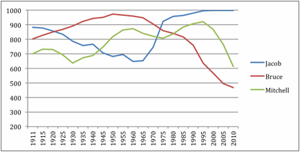
Figure 2.
Inverted rank order of male name popularity
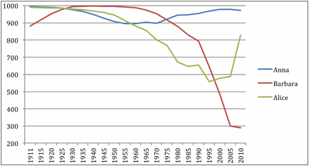
Figure 3.
Inverted rank order of female name popularity
Many
agent-based simulations that assume interest ascends until boredom overtakes it
predict that popularity of any name will increase steadily until some apex then
fall steadily thereafter. Some of these simulations might also predict that,
after a steady fall to a nadir in popularity, a name will eventually become
novel again, attracting new interest from a new generation of parents. To test
these predictions for each name, we need only find the maximum/apex or
minimum/nadir of the relevant plot, then examine what happens in the years
surrounding (but not including) the maximum or minimum. For example, Figure 2
shows that the popularity of Bruce reached its apex in 1950. If a
steady-rise/steady-fall prediction is correct, then all pairs of observations
from 1911 to 1945 should go up, and all observations from 1955 to 2010 should
go down. Our set of predictions, call it the
Bruce Set, should thus look like this:
Bruce(1945) > Bruce(1940), Bruce
(1935), Bruce(1930), …, Bruce(1911)
Bruce(1940) > Bruce(1935),
Bruce(1930), Bruce(1925) …, Bruce(1911),
…
Bruce(1915) > Bruce(1911),
and
Bruce(2010) > Bruce(2005),
Bruce(2000), Bruce(1995), …, Bruce(1955)
Bruce(2005) > Bruce(2000),
Bruce(1995), Bruce(1990) …, Bruce(1955),
…
Bruce(1960)
> Bruce(1955).
There are
21*20/2 = 210 order pairs that could be compared. If these, the Bruce Set
addresses the eight years earlier than 1950 (1911 to 1945) and the 12 years
later than 1950 (1955 to 2010). There are 8*7/2 = 28 pairs earlier than 1950,
and 12*11/2 = 66 pairs later than 1950 for a total of 28+66 = 94 pairs. Thus
the scope of the predictions for The Bruce Set is 94/210 = 0.45.
How many of
the 94 ordered pairs addressed in the Bruce Set are confirmed by the data?
Visual inspection gives a clear answer. All ranks in the popularity of Bruce
from 1911 to 1945 increase monotonically; so all 28 predictions are confirmed.
All ranks in the popularity of Bruce from 1955 to 2010 decrease monotonically,
so all 66 predictions are confirmed. In summary, the Bruce Set shows 28+66 = 94
hits, 0 misses and 0 ties.
Evidential
statistics for the remaining five names can be calculated in a similar fashion.
For a second example, consider the popularity of the name Jacob. The highest
rank of Jacob (in 2000, 2005 and 2010 Jacob was ranked #1 in popularity) occurs
at the end of the data set, so we do not know if it would decline in future
years. We do know, however, that it reached a nadir of popularity in 1960. If a
simulation predicts a steady downward trend before a nadir, and a steady upward
trend after a nadir, we can assess the validity of these two predictions with
Jacob’s data before 1960 and with data after 1960. The set of predictions would
look something like this:
Jacob(1911) > Jacob(1915),
Jacob(1920), Jacob(1925), …, Jacob(1955),
Jacob(1915) > Jacob(1920),
Jacob(1925), Jacob(1930), …, Jacob(1955),
…
Jacob(1950) > Jacob(1955),
and
Jacob(2010) > Jacob(2005),
Jacob(2000), Jacob(1995), …, Jacob(1965),
Jacob(2005) > Jacob(2000),
Jacob(1995), Jacob(1990), …, Jacob(1965),
…
Jacob(1970)
> Jacob(1965).
Following
the procedure for analysing the Bruce Set of predictions, we first note that
the Jacob Set includes the 10 years shown before 1960, and the 10 years shown
after 1960. So the number of year-pairs for which predictions are included in
Jacob Set is 10*9/2 + 10*9/2 = 45 + 45 = 90, yielding a scope for the Jacob Set
of 90/210 = 0.43. We can then employ the OPA programme shown in Appendix A to
calculate OPA indices for predictions covering years before Jacob’s 1960 nadir (1911
to 1955), and for predictions covering years after Jacob’s nadir (1965 to
2010). We repeat the procedure for Mitchell, Anna, Barbara and Alice. Table 5
shows the calculations of OPA indices for all six baby names.
Table 5.
Hits, misses, ties and OPA indices of baby name popularity.
|
Name |
Year of
(a)pex or (n)adir |
Before
apex or nadir |
After
apex or nadir |
PH |
IOF |
||||
|
|
|
Hits |
Misses |
Ties |
Hits |
Misses |
Ties |
|
|
|
Bruce |
1950 (a) |
28 |
0 |
0 |
66 |
0 |
0 |
1.00 |
1.00 |
|
Jacob |
1960 (n) |
43 |
2 |
0 |
42 |
0 |
3 |
0.98 |
0.95 |
|
Mitchell |
1995 (a) |
108 |
28 |
0 |
3 |
28 |
0 |
0.80 |
0.60 |
|
Anna |
1955 (n) |
36 |
0 |
0 |
51 |
3 |
1 |
0.97 |
0.93 |
|
Barbara |
1940 (a) |
15 |
0 |
0 |
91 |
0 |
0 |
1.00 |
1.00 |
|
Alice |
1995 (n) |
134 |
1 |
1 |
3 |
0 |
0 |
0.99 |
0.98 |
|
|
|||||||||
|
Totals |
|
364 |
31 |
1 |
|
0.92 |
0.84 |
||
|
Totals |
|
|
256 |
31 |
4 |
0.89 |
0.78 |
||
True to our
preferred practice of analyzing before aggregating, the PH and IOF indicants
shown for the six baby names in Table 5 suggest that any simulation generating
a steadily up/down or down/up pattern in baby name popularity would be rewarded
with a pretty good S-O fit for Mitchell and beautiful fit for the five
remaining names. The totals at the bottom of Table 5 additionally indicate that
the fits across the six names are quite high, and that the are close to equal
for before- and after-apex/nadir predictions.
Confirmation
of a simulation’s predictions does not, of course, confirm the validity of the
simulation. There are likely several simulations that could be created to
generate the predictions leading to the results shown in Table 5, each
simulation differing in psychological assumptions about the mechanisms or
influences of baby name selection. Still, the predictive success shown in Table
5 should prompt someone to create two or more relevant simulations, and to find
a new set of data that would lead each simulation to make different predictions
than the others. We discuss how to do it in our follow-up article.
Analysing Differences Between Groups
Our two
examples above, hypothetical seating patterns of students and real baby name
popularity, both examine changes in variables over time. Time-related changes
– often called within-participant differences -- are important for
testing most simulations. But many simulations predict group or situation
differences – often called between-participant differences -- as well. How can these differences
be analysed with OPA?
To answer
the question, let us assume someone developed an agent-based simulation that
generates predictions of individual differences in cognitive processes by which
parents choose baby names. One such simulation, for example, might assume parental
agents weigh several factors in making a name choice, one of which is related
to uniqueness versus commonality. Some proportion of
parents, especially in decades past, might consider uniqueness-commonality
differently when naming boys than when naming girls. For example, some parents
might reason that baby girls should be given a unique first name because they
are more likely than baby boys to lose their family name when they marry. Other
parents might believe that boys with unique names would be teased more than
would girls with unique names, and thus be more conservative in their male name
choices.
Parents, of
course, could adopt any of dozens of other reasoning processes to choose names
for their children. But if simulation agents were programmed to be more
traditional or strict when selecting male names than when selecting female
names, then the simulation would surely generate sex differences in name
variety. In particular, the simulation would show that the variety of female
names would be higher than the variety of male names. Thanks to the Social
Security Administration’s baby name database, we can test this prediction.
There are
many different ways to measure the variety of baby names in the database, a few
of which can be easily computed. One set of data tables, for example, shows
what percentage of males and of females were given each of the 20 most popular
names from the Social Security Administration’s list of 1,000 names. If there
were no variety, 100% of babies would be given the same name, so the 20 most
popular names would contain 100% of all babies. At the other extreme, if there
were maximum variety, each of the 1,000 names would be given to an equal
percentage of babies, so the most popular 20 names would together account for
only 20/1000 = 2% of all babies. The lower the percentage between 100 and 2 the
greater variety there would be. If, for example, the top 20 male names
accounted for 39% of all male babies, and if the top 20 female names accounted
for 12% of all females, then we could infer that there was more variety among
female names than among male names.
Using the
baby name data, we calculated the percentages of males and females given one of
their top 20 names in the year beginning each decade from 1890 to 2010. The
results are plotted in Figure 4.
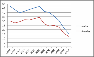
Figure 4.
Percentage of males and females given one of the top 20 names for their year of
birth.
Traditional
Analysis of Variance and Chi Square fans should recognize Figure 4 as the plot
of a 2 (sex) by 13 (decade) experimental design. Some might even argue it is a
design mixing independent and linked data because parents can be influenced by
their parents and contemporaries, and because parents often have, and thus
name, more than one baby. Still, we cannot perform a traditional Analysis of
Variance on the data because we have only one observation in each of the 26
cells. And we cannot perform a traditional Chi Square because the data
represent percentages, not the raw frequencies required for Chi Square tests.
More precisely, we could calculate an Analysis of Variance and a Chi Square to
generate F and Chi Square statistics, but we could not convert these statistics
into p(alpha) significance test values without worrying how accurate the values
might be.
How can we
employ Ordinal Pattern Analysis to test the simulation’s sex-difference
predictions using the data shown in Figure 4? Recall that Ordinal Pattern
Analysis gives us evidential not inferential statistics, so we need not worry
about generalizing from the sample in Figure 4 to the population. Instead we
need only focus on a more tractable form of generalization: How well the
predictions of the simulation generalize to the sample we have. If someone
selected at random one of the 13 years shown in Figure 4, what are the chances
that the variety index for females would be higher (the plotted concentration
would be lower) than for males? More tediously, the simulation makes the
following 13 predictions about the percentage of babies with Top 20 names for
their sex:
Males(1890) > Females(1890);
Males(1900) > Females(1910);
Males(1920) > Females(1920);
Males(1930) > Females(1890);
…
Males(2010) > Females(2010).
Thanks to
the beauty of the data shown in Figure 4, we need not use our fingers or mental
prosthetics such as the programme in Appendix A to calculate how many of the
above 13 predictions are confirmed; the inter-ocular trauma test will suffice.
All 13 of the 13 predictions match the observations: 13 hits; 0 misses; 0 ties;
PH = 1.00; IOF = 1.00.
We note in
passing, two additional trends not addressed by the simulation. First, the
percentage of males and females given one of the top 20 names for their year of
birth rose consistently from 1910 to 1950, then declined consistently from 1960
to 2010. Second, the difference in percentage declined more-or-less
consistently from 1890 to 2010. We could calculate the degree of consistency in
these trends using OPA indices, but we can think of no simulation that might
predict them. The first trend does, however, parallel intellectual and
counter-cultural discussions about conformity in the US that peaked in the
1950s and ‘60s, while the second trend indicates that norms for naming males
are becoming closer to norms for naming females than vice-versa. The trends
also alert us to the dangers of programming agents with rules mimicking to
cognitive processes that do not change with the times.
Discussion
We began
our article by noting the desirability and the challenges of assessing the
goodness of fits between simulation outputs (S) and sets of observations (O).
We then discussed two of the challenges in detail: those created by problems of
measurement, and those created by problems of aggregation. We claimed these
problems could be solved by creating goodness-of-fit tests that examined the ordinal
properties of predictions and observations and that analysed these properties
case-by-case before aggregating across the analyses. The arguments led us to
adapt two old but generally-ignored approaches to analyzing S-O fit: evidential
statistics and Ordinal Pattern Analysis (OPA).
OPA is not, of course, the only method invented to assess S-O fit. Traditional, least-squares methods (see, for example, Hayashi, 2000) remain suitable for analyzing fits among the point predictions of simulations and relevant sets of ratio-scale aggregated observations when such requirements are met. Nonparametric alternatives to OPA also exist, some suitable for assessing the fit between distributional characteristics of simulation outputs and of relevant observations. One such alternative is the Kolmogorov–Smirnov measure of distribution fit (Stephens 1974), providing an index of the difference between predicted and observed distributions from the area that would lie between the two distributions if their cumulative versions were drawn on top of each other. Corder & Foreman (2009) provide an accessible description of this measure. The value is test statistic that can be related to the probability that two sets of data are drawn from the same distribution, but this can also be used as a goodness of fit test.
Like OPA indices, Kolmogorov-Smirnov (K-S) measures do not require any strong assumptions about the distributions of simulated and observed data. However, they were developed for continuous distributions, and are more sensitive near the centre of the distribution than the edges. K-S measures are more suitable than least-squared measures for assessing the fits of static distributions, but are not as flexible as the ordinal approach outlined here. OPA seems most suitable for assessing the results of dynamic processes as they occur over time.
We believe the segregation and baby-name examples illustrating some of the features of OPA are representative of many situations facing researchers wishing to assess the validity of their simulations. They are not, however, the only representative cases. Sometimes, for example, we have the luxury of assessing the fit of two or more different simulations to one or more sets of data. When this occurs, it is important to determine what predictions the simulations have in common (mutual), what predictions are opposite (conflicting), and what predictions are made by each simulation that are not made by the others (unique). We can then partition fits into their mutual, conflicting and unique components. Some simulations might make more predictions than others, generating a larger scope. When this happens, the scope of simulations also become important in comparing them.
There will
likely never be many, if any, critical experiments that generate data allowing
us to validate only one simulation while invalidating the rest. Instead, we are
more likely to find that each simulation sometimes gives a better fit than
others, sometimes a worse fit, depending on the data set used in the
assessment. The possibility prompts two important questions: How do we
aggregate analyses across data sets? And how do we determine what distinguishes
the data sets that best fit one simulation from the data sets that best fit
another simulation? We shall address these questions in our next article.
As
we noted in our introduction, the shape of a simulation’s output is often its most
important feature when assessing the output’s fit with stylized facts in the
social sciences. We have here presented a coherent method for assessing the
extent of such a fit in a transparent, formal, and reproducible manner. Our
emphasis on ordinal properties of data, simulated and real, does not make the
resulting analyses any less scientific than more traditional, least-squared
measures. OPA is often more appropriate than traditional methods for the simulations
and observations found in the social sciences It is well-suited for capturing
the essence of longitudinal data that results from the dynamic processes
represented in social simulations and is just as rigorous.
Acknowledgements
Bruce Edmonds was supported by the Engineering and Physical Sciences Research Council, grant number EP/H02171X/1.
References
Bennett, D. S. (2008). Governments, Civilians, and the Evolution of Insurgency: Modeling the Early Dynamics of Insurgencies. Journal of Artificial Societies and Social Simulation 11(4):7 (http://jasss.soc.surrey.ac.uk/11/4/7.html).
Boland (1987). Stylized Facts. In Eatwell, J.; Milgate, M.; Newman, P.. (eds.) The New Palgrave Dictionary of Economics. Vol 4. London: Macmillan Press, 535–536.
Cantner, U., Ebersberger, B., Hanusch, H., Krüger, J.J. and Pyka, A. (2001) Empirically Based Simulation: The Case of Twin Peaks in National Income. Journal of Artificial Societies and Social Simulation 4(3):9 (http://www.soc.surrey.ac.uk/JASSS/4/3/9.html)
Corder, G.W. & Foreman, D.I. (2009).Nonparametric Statistics for Non-Statisticians: A Step-by-Step Approach Wiley
Edmonds, B. and Hales, D. (2003) Replication, Replication and Replication: Some Hard Lessons from Model Alignment. Journal of Artificial Societies and Social Simulation 6(4):11 <http://jasss.soc.surrey.ac.uk/6/4/11.html>
Edwards, A.W.F. (1972). Likelihood. Cambridge: Cambridge University Press.
Fisher, R. (1937). Statistical methods and scientific inference. New York: Hafner Press.
Galán, J. M., Izquierdo, L. R., Izquierdo, S. S., Santos, J. I., del Olmo, R., López-Paredes, A. and Edmonds, B. (2009). Errors and Artefacts in Agent-Based Modelling. Journal of Artificial Societies and Social Simulation 12(1)1 (http://jasss.soc.surrey.ac.uk/12/1/1.html).
Garmire, G. & Riegler, G. R. (1972) Low Energy X-Ray Survey from the Crab Nebula to Cygnus. Astronomy and Astrophysics, Vol. 21, p. 131-138 (1972)
Hayashi, Fumio (2000). Econometrics. Princeton, NJ: Princeton University Press.
Heine, B.-O.; Meyer, M. & Strangfeld, O. (2005). Stylised Facts and the Contribution of Simulation to the Economic Analysis of Budgeting. Journal of Artificial Societies and Social Simulation, 8(4):4.
Kaldor, N. (1961/1968). Capital Accumulation and Economic Growth. In Lutz, F A and Hague, D C (Ed.) The Theory of Capital. Reprint. London: Macmillan, pp. 177-222.
Kuhn, T. (1966). The Structure of Scientific Revolutions. University of Chicago Press.
London, I. & Thorngate, W. (1981). Divergent Amplification and Social Behavior: Some methodological considerations. Psychological Reports, 48, 203-228.
Moss, S. (2001) Game Theory: Limitations and an Alternative. Journal of Artificial Societies and Social Simulation 4(2):2 (http://www.soc.surrey.ac.uk/JASSS/4/2/2.html)
Oxford English Dictionary (2011), Third edition, September 2011; online version December 2011. (http://oed.com/view/Entry/179546); accessed 26 January 2012.
Parsons, D. (1975). The Directory of Tunes and Musical Themes. London: S. Brown.
Schelling, T. (1969). Models of segregation. The American Economic Review, 1969, 59(2), 488-493.
Siegel, S., & Castellan, N.J. (1988). Nonparametric statistics for the behavioral sciences, 2nd edition. New York: Wiley & Sons.
Solow (1969). Growth Theory: an Exposition (Paperback ed.). New York, NY: Oxford Univ. Press.. p. 2.
Stephens, M. A. (1974). EDF Statistics for Goodness of Fit and Some Comparisons. Journal of the American Statistical Association (American Statistical Association) 69(347): 730–737.
Thorngate, W. (1986a). The production, detection, and explanation of behavioural patterns. In J. Valsiner (Ed.), The individual subject and scientific psychology. New York, Plenum, pp. 71-93.
Thorngate, W. (1986b). Ordinal pattern analysis. In W. Baker, M. Hyland, H. van Rappard, & A. Staats (eds.), Current issues in theoretical psychology. Amsterdam: North Holland, pp. 345-364.
Thorngate,W. (1992). Evidential statistics and the analysis of developmental patterns. In J. Asendorpf & J. Valsiner (Eds.), Stability and change in development: A study of methodological reasoning. Newbury Park, CA: Sage, pp. 63-83.
Thorngate, W. & Carroll, B. (1986). Ordinal pattern analysis: A method for testing hypotheses about individuals. In J. Valsiner (Ed.), The individual subject and scientific psychology. New York, Plenum, pp. 201-232.
Tukey, J. (1960). Conclusions vs. decisions. Technometrics, 2(4), 423-433.
Tukey, J. W. (1969.) Analyzing data: Sanctification or detective work? American Psychologist, 24, 83 - 91.
Windelband, W., & Tufts, J. (1901). A history of philosophy: With especial reference to the formation of development of its problems and conceptions (2nd edition). London: The Macmillan Company.
Appendix A.
Source code for calculating
hits, misses, ties, and NA comparisons
Written in programming
language “R”
Instructions:
1. Download the programming language “R” from
2. Install R on your computer
3. start R and select from its menu the “Create a
new, empty document in the editor” icon (the one to the left of the printer
icon at the top of the R window in version 2.14);
4. copy the entire programme below;
5. paste it into the R editor;
6. save the programme in a familiar place under
the name “OPA”;
7. …..
Here is the Ordinal Pattern
Analysis (OPA) programme.
gtcalc=function(pred,obs) {
a=length(pred) ##calculate how many prediction pairs there are
b=seq(from = 1, to = a-1, by = 2) ## for each pair..
hits = 0 ## set hit counter to zero
misses= 0 ## set misses counter to zero
ties= 0 ## set ties counter to zero
nNA= 0 ## set number of NA occurances to zero
for(i in b) {
x=pred[i] ## get index of first observation
y=pred[i+1] ##get index of second observation
if(is.na(obs[x]) | is.na(obs[y])) {nNA=nNA+1;}
else
{if(obs[x]>obs[y]) {hits=hits+1};
if(obs[x]<obs[y]) {misses=misses+1}
if(obs[x] == obs[y]) {ties=ties+1}
} ## end of else clause
} ## end of for iteration
return(c(hits,misses,ties,nNA))
}
gt=function(pred,obs) {
realhits=gtcalc(pred,obs) ## get hits for real data
print(c("Number of obtained hits: ",realhits[1]), quote = FALSE) ## print hits for real data
print(c("Number of obtained misses: ",realhits[2]), quote = FALSE) ## print misses for real data
print(c("Number of obtained ties: ",realhits[3]), quote = FALSE) ## print hits ties real data
print(c("Number of NA comparisons: ",realhits[4]), quote = FALSE) ## print NA comparisons for real data
print(c("Probability of a > hit (PH): ",realhits[1]/(sum(realhits[1:3]))), quote = FALSE)
print(c("IOF: ",(realhits[1]-realhits[2])/(sum(realhits[1:3]))), quote = FALSE)
## now shuffle data 1,000 times to see how often #hits is greater than realhits
nobs=length(obs)
exceeds=0 ## set exceeds counter to zero
for(j in 1:1000) {
obs=sample(obs,nobs)
randhits=gtcalc(pred,obs)
if(randhits[1]>=realhits[1]) {
exceeds=exceeds+1
}
}
print(c("Probabiliy of random permutation hits >= obtained hits = ",exceeds/1000), quote = FALSE)
return(c("done!"))
}
gte=function(pred,obs) {
realhits=gtcalc(pred,obs) ## get hits for real data
print(c("Number of obtained hits: ",realhits[1]), quote = FALSE) ## print hits for real data
print(c("Number of obtained misses: ",realhits[2]), quote = FALSE) ## print misses for real data
print(c("Number of obtained ties: ",realhits[3]), quote = FALSE) ## print hits ties real data
print(c("Number of NA comparisons: ",realhits[4]), quote = FALSE) ## print NA comparisons for real data
print(c("Probability of a >= hit (PH): ",(realhits[1]+realhits[3])/(sum(realhits[1:3]))), quote = FALSE)
print(c("IOF:
",(realhits[1]+realhits[3]-realhits[2])/(sum(realhits[1:3]))), quote = FALSE) ## print NA
comparisons for real data
## now shuffle data 1,000 times to see how often #hits is greater than realhits
nobs=length(obs)
exceeds=0 ## set exceeds counter to zero
for(j in 1:1000) {
obs=sample(obs,nobs)
randhits=gtcalc(pred,obs)
if(randhits[1]>=realhits[1]) {
exceeds=exceeds+1
}
}
print(c("Probabiliy of random permutation hits >= obtained hits = ",exceeds/1000), quote = FALSE)
return(c("done!"))
}